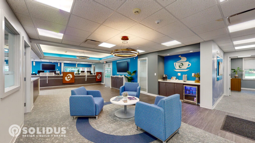
We are excited to announce the completion of our latest branch renovation for Savers Bank in Auburn, MA. The attention to detail that we achieved with this project is a testament to the success of our collaboration with their team. From the illuminated interior teller logos to the custom window film featuring historical photos of the area, the design of this branch is both modern and traditional, with nods to the past and eyes on the future.
Many of the new branding elements that were introduced at their Sturbridge branch were carried into this project, giving their network greater consistency and helping them establish a signature style. To increase the bank’s visibility the exterior façade was altered to accommodate two new, towering structures that frame and canopy the front and side entrances of the building. At night the bank’s name and logo appear sharply lit on each tower in bright green lettering.
Design choices were often driven by the bank’s connection to the neighborhood, with an emphasis on strengthening their brand recognition. A decorative coffee mug decal above the beverage station features a cut out of their logo and the wallpaper behind their community postings board is a black & white photo of the local wetlands. To encourage the flow of natural light, many interior walls were fitted with window openings, allowing for more panoramic views of the space.
Finish selections are a delicate blend of blues and grays, with softer shades used in each of the private offices. This color pallet, coupled with our uncluttered approach to retail communications and minimal artwork left the space feeling clean and refined. We had a great experience working with this client and we hope this renovation leaves a lasting impression on their customers.
A hearty congratulations to our team, and theirs! May our partnership continue to grow.


