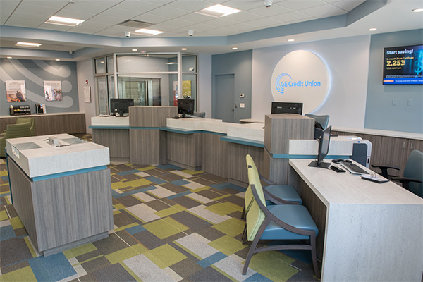
GE Credit Union decided to move into New Haven, which meant a brand new market presence for them. They selected a building that had previously been a bank (there was an existing teller line which the client planned to use) and moved in with the intention of opening up as a traditional-looking branch following a basic refresh of carpet and paintwork, etc.

The credit union’s logo in the entryway of the now fully-renovated branch.
One week after they signed the lease, a pipe burst and flooded the entire branch.

The opposite wall in the entryway, showing the branded ATM surround and graphic wall.
Everything had to be removed, including flooring and teller line. The drywall had to be cut out, three feet from the floor all around, and removed. At this point the credit union contacted Solidus, and after the usual consultations, we set to work restoring and transforming the space.
They wanted a fresh new branch layout for their New Haven office, with the chief requirements being flexibility and impact. They also wanted this to be their first branch that had pods. We presented some designs to the client, and after some slight alterations we were able to give the credit union a whole new look. Much of this was centered on rebranding; our brand designer delivered a beautiful contemporary brand presence that the credit union loves.
Our environmental graphic designer created patterned vinyl privacy banding that was applied to the glass office walls, featuring the credit union’s logo interspersed with semi-opaque circles. The effect transformed the space into a stylish and interesting working environment.

Glass offices, featuring vinyl privacy banding composed of circles and GE Credit Union’s logo.
The branch layout had to accommodate the client’s needs from a branding and banking standpoint while also being modifiable enough to accommodate community functions.
To achieve this, we designed a removable glass wall in one of the offices, adjacent to large wall closets, behind sliding doors in which chairs could be discreetly stacked and taken out when needed.

A view of the seating area and adjacent storage area where chairs for community events can be stored. Doors open and closed.
The branch features a series of branding “hits” for maximum impact. There is a graphic wall and circular branded surround on the ATM in the vestibule, a large illuminated circular branding feature focused on the credit union’s logo behind the pod, and large branded graphics on the far wall close to the sliding glass doors – it was a minimal approach but it maximized the effect of each branding element.

We designed a large circular branding element behind the pods that is the centerpiece of the branch.
The intent was to create high impact focal points in a small space. We wanted texture and movement. To break the familiar mold of the rectangle or square, we used circles to really anchor features on the wall.

A view from inside a glass office of the pods and impressive branding element.
We also had to balance the colors. There are a lot of colors that had to be integrated with the interior finishes in a way that didn’t overpower the other elements. When we presented color palettes the client chose the one that was the most dramatic. They wanted to make a statement, and they succeeded in a bold and stylish way.

The bold blue circular surround on the drive-thru ATM is seriously eye-catching to passing traffic.
We enjoyed a great working relationship with the client throughout the project. We finished on time, and we are now planning other projects for GE Credit Union.


