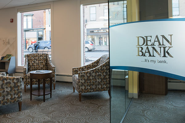
This client wanted to renovate a 3,400 sq. ft. branch in the center of Franklin, Massachusetts. The bank was dealing with an overflow of staff from various other locations but this branch had no space to expand its footprint due to its central location.

Before. The view of the platform from the second balcony.
We developed a plan to build a second floor in the branch foyer (it had a high ceiling and was looked down on from an internal balcony above), which was quite challenging. This allowed people from other locations to be relocated to the extra space created by the second-floor construction. The general plan was then expanded to allow for other features such as pods and branding, with a child-friendly community focus.

The old teller line, which we demolished and replaced with contemporary pods (below).

One of the two pods we built in the newly transformed branch.
The project required intensive coordination, as work was being performed in all areas of the branch and required a lot of phases. We set up a temporary pod to conduct business at the beginning of the project and phased around it. The client did a fantastic job cooperating with us, working with the space they had available during various phases of the project. They lost no time anywhere in the whole branch, which is always our goal during projects where the branch remains open during renovations.

The new reception desk at one entrance to the branch, showing some of our design files for comparison.

The previous reception area looked very different from how it looks today.
The branch has two entrances, which tested our creativity. In the main entrance off the parking lot, we redesigned the reception desk and created a community-focused wall. Opposite the reception desk, we designed a beverage center with a flat screen display and high tables and stools where customers can rest and drink coffee or tea.

The beverage center and high tables and stools where customers can take five and enjoy the welcoming, relaxed atmosphere in the transformed branch.
The other entrance contains a rich gray graphic wall that houses an ATM and depicts a historical scene showing the main street in Franklin and the clock that still stands outside the branch. The ATM is accessible to customers in the evening after the evening partitioning is in place.

The glass sections are stored in a large closet and can be slid out on the track piece by piece for evening ATM access when the branch is closed.
The evening partitioning comprises glass sections that divide the lobby from the rest of the platform that can be slid into place on a track each evening when the branch closes. These partitions join together and are secured by floor locks. The glass sections are quite thick and required us to add some extra LVL blocking to the ceiling we built to fill in the space in the original platform. The result is a beautiful segmented transparent barrier that allows customers to see into the transformed branch during the evening while accessing the ATM.

The fish tank (seen here before we started work) was protected by a temporary cover while we performed this extensive renovation around it.

The modernized branch, showing a pod and the fish tank, which has been considerably beautified by the transformation. The evening partition is also in place.
There is a fish tank in the branch, which is visible in the before and after shots (above), and we had to work around the tank for the entire duration of the project. We built a temporary protection around it, which was removed once the ceiling and new second floor were completed. Close to the tank is an informal seating area with a bookcase full of children’s books, as the branch theme is kid-centric as well as community focused.

Branch view showing the new pods and flat screen display.
The branch now has two branded pods with cash recyclers in place of the long teller line that existed previously. We added extra steel in the basement to support the recyclers. Several angled glass fronted offices surround the edge of the platform, which allow natural light to circulate through the entire space.

A view of the offices around the edge of the platform, showing the wide vinyl privacy banding that is branded with the bank’s logo.
The glass office walls feature wide vinyl privacy banding bearing the bank’s logo, which makes a significant statement as the frosted banding captures visitors’ attention as they enter. We also created a plaque showing the names of the Board of Directors.

The graphic wall featuring a historical image of Franklin’s Main Street.
There are several new offices now located in the area that was formerly balcony and empty space. All areas of the branch were painted, furnished, and were given new carpeting or flooring.


