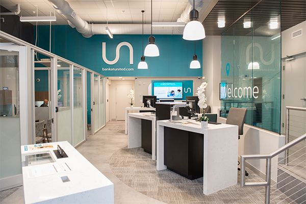
This was United’s first real attempt at creating a modern, city-feeling branch. We had to capture a compact, split-level, urban atmosphere that was bright and fresh. It was a complicated space to design in order to meet all needs for things such as ADA bathrooms, water fountains, three offices, a workroom for the safe, etc. This particular space is situated above a sub-street parking garage, so the weight of the vaults plus the recyclers was significant for such a small footprint. As a result, we had to install a lot of structural steel under the branch in the garage, and spray-apply fireproofing, etc.

The view into the compact branch from the upper level.
This branch was created in a space that used to be a McDonald’s and a neighboring Starbucks. There was a mezzanine in the space that we converted into a bank branch. There is also a change in elevation of about 16” from the front door to the back of the space. In the previous version of the space, this necessitated a 20-foot long ramp which would have eaten up a lot of retail space. To overcome this spatial issue we constructed two steps and a lift – not an elevator, but an ADA-accessible lift with a battery backup that is located behind its own door. Battery backup was required because it needs to be a means of egress in the event of a fire and must function without power. Now, anyone with a handicap who can’t go down the two steps can use this lift. The split-level feel and steps to lower platform area complement the overall sense of urban compactness necessary in this design.

Sleek pods, pendant lights, and cool branding palette.
There are two pods with recyclers, and three private, open-topped, glass-walled offices comfortably configured in the platform. Pendant lights and suspended clouds were used to provide lighting throughout the entire space.

The cash recycler is visible at the back of this pod, in a view back towards the entrance. The doors to the handicap lift are at right, center.
A challenging aspect of this project was that it was at the base of one of the City Place towers, so everything we did could potentially have impacted the tower. It involved a lot of coordination with sprinkler work. Whenever working with the sprinkler system, the building’s owners and fire department have to be notified, and the entire system drained. This delicate process can activate the smoke detectors among other things. We also had to do some work in other tenants’ spaces, including a bank next door, where we performed HVAC work at off-hours.

An upscale, urban chic look can be achieved in a New England bank branch.
The finished product is an exceptional modern space that is both swish and cool. We worked hard to make practical modifications and materials decisions to deliver a less expensive and more efficient solution without losing any of the quality. The very different pod design resembles kiosks at an upscale mall, with lots more open space incorporated into the physical structure of the pods themselves. This design type was used as a springboard for other United Bank branches we designed in Greenwich and Westport, with each branch featuring consistent aesthetics while retaining its own unique character and appeal to its market.

Another look at the open pod design and cash recycler, with glass-walled offices, pendant lights and suspended clouds.
This downtown Hartford branch is perfect as a desirable and popular banking spot for the city’s lively and cosmopolitan population.

View along the exterior of the three offices and into an office with a window.


