Our latest project with Savings Institute Bank & Trust was a small ground up branch in Groton, CT. This is the third project we’ve done with this client. The bank is familiar with our process at this point, and we were able to traverse the planning phase with relative ease. There was an existing branch across the street which the bank wanted to close as it was too big and inefficient. It had been determined that a smaller footprint branch was more efficient and desirable, so we worked with the landlord to create a building on the strip mall pad.
At that point we began our process; we had a preliminary design meeting with the client and surveyed them on exactly what they were looking for. We then coalesced all of that information and went into design.
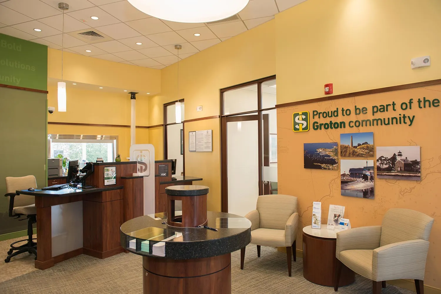
The branch across the street in the existing, bigger building had a larger client base, so an extra pod was required in the new branch. This made it tight for the area we had to work with, but two pods were required, including a sit-down pod.
In the old facility, there were eight teller stations which we consolidated in the new branch into just two pods. There is LED lighting throughout the branch, and there are tulip accent lights that hang over the pods and provide direct light to that area.
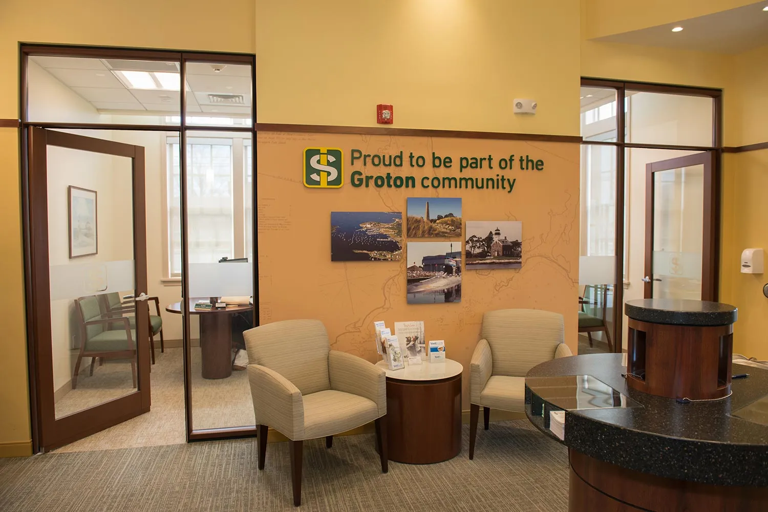
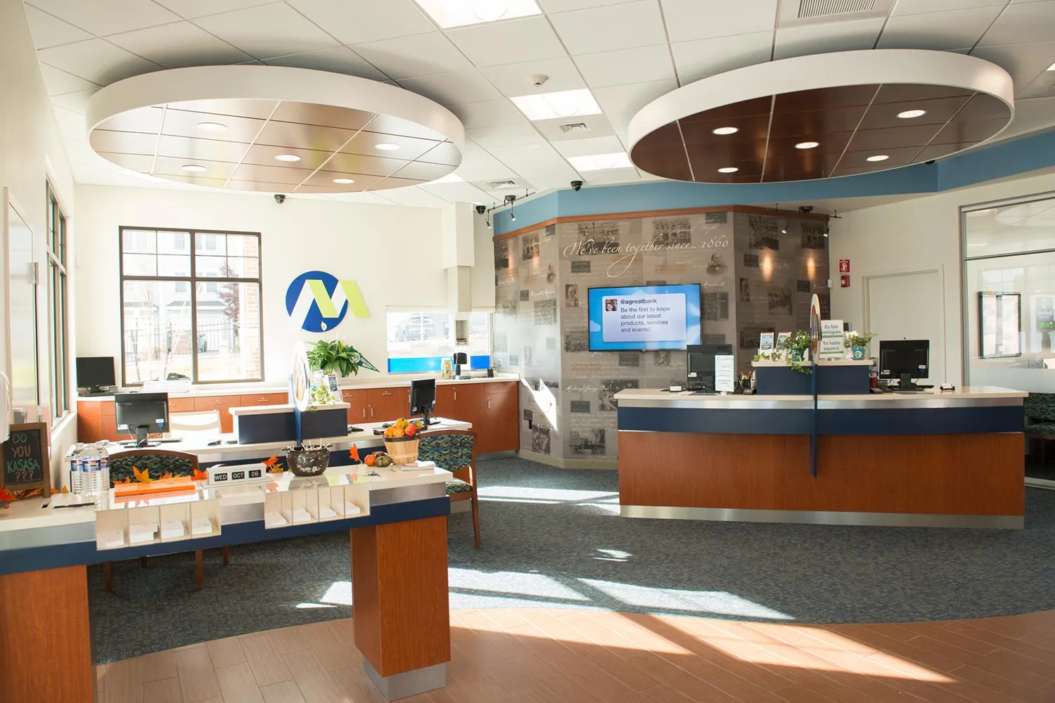
There are three graphic and/or branded walls inside the branch. One is a branded wall at the beverage center, which also includes a flat-screen display where local news and ad content can be promoted, as well as NASDAQ and other financial programs. One is a wall similar to the walls in Tolland and Newport, which emphasizes the bank’s pride in being a part of the community, with a map and photographs of local landmarks. The third is the main wall facing customers are they enter the branch, featuring the bank’s logo and a picture of a lighthouse on the nearby Block Island Sound.
The branch, both interior and exterior, is very similar to the Tolland branch. One difference is that the chair rail that decorates the interior walls was constructed from the same material as the millwork in the Groton branch, and we think this looks better than the similar feature at Tolland, which is a form of stained pine.
There were five offices which we transformed into two offices and a refrigerator/vault area. The offices contain the same window soffits as the Tolland branch, to help light the interior space more effectively using natural light. The ceiling adjacent to the windows is higher than the rest of the ceiling, allowing the windows to be higher and radiate more sunlight into the offices.